
K-swiss europe
Step into the world of K-Swiss, where I’ve had the pleasure of creating bold, standout designs for this iconic brand. From a unique series of stickers that bring their heritage to life, to sleek brochures and custom graphics tailored to their vision, this collaboration was all about pushing creative boundaries. Explore how I infused my distinctive style into their projects, blending modern design with classic K-Swiss vibes.
K-SWISS STICKERS
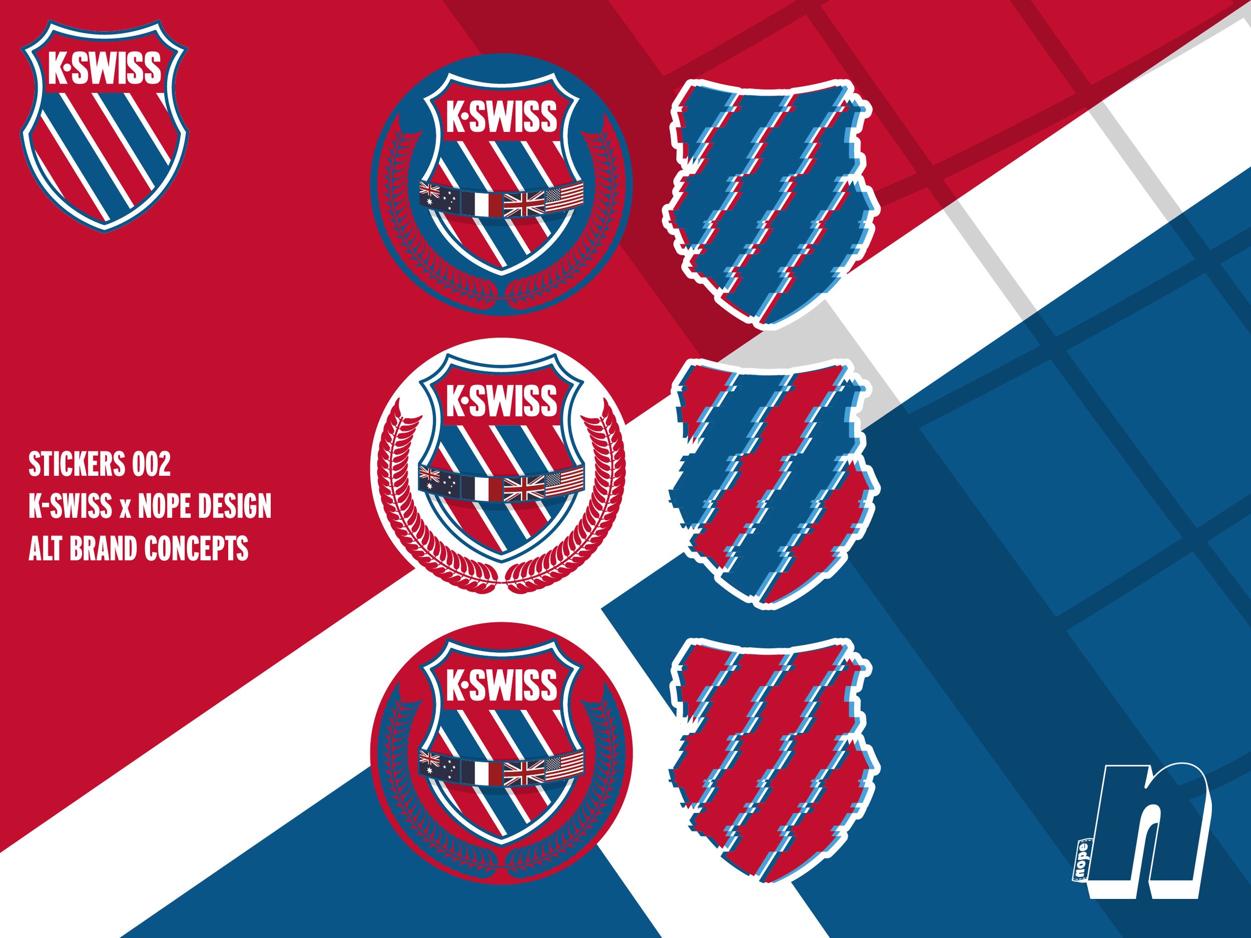
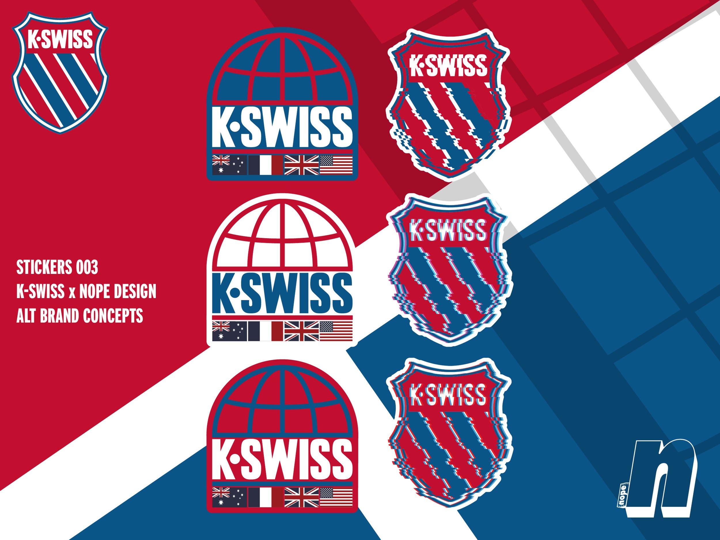
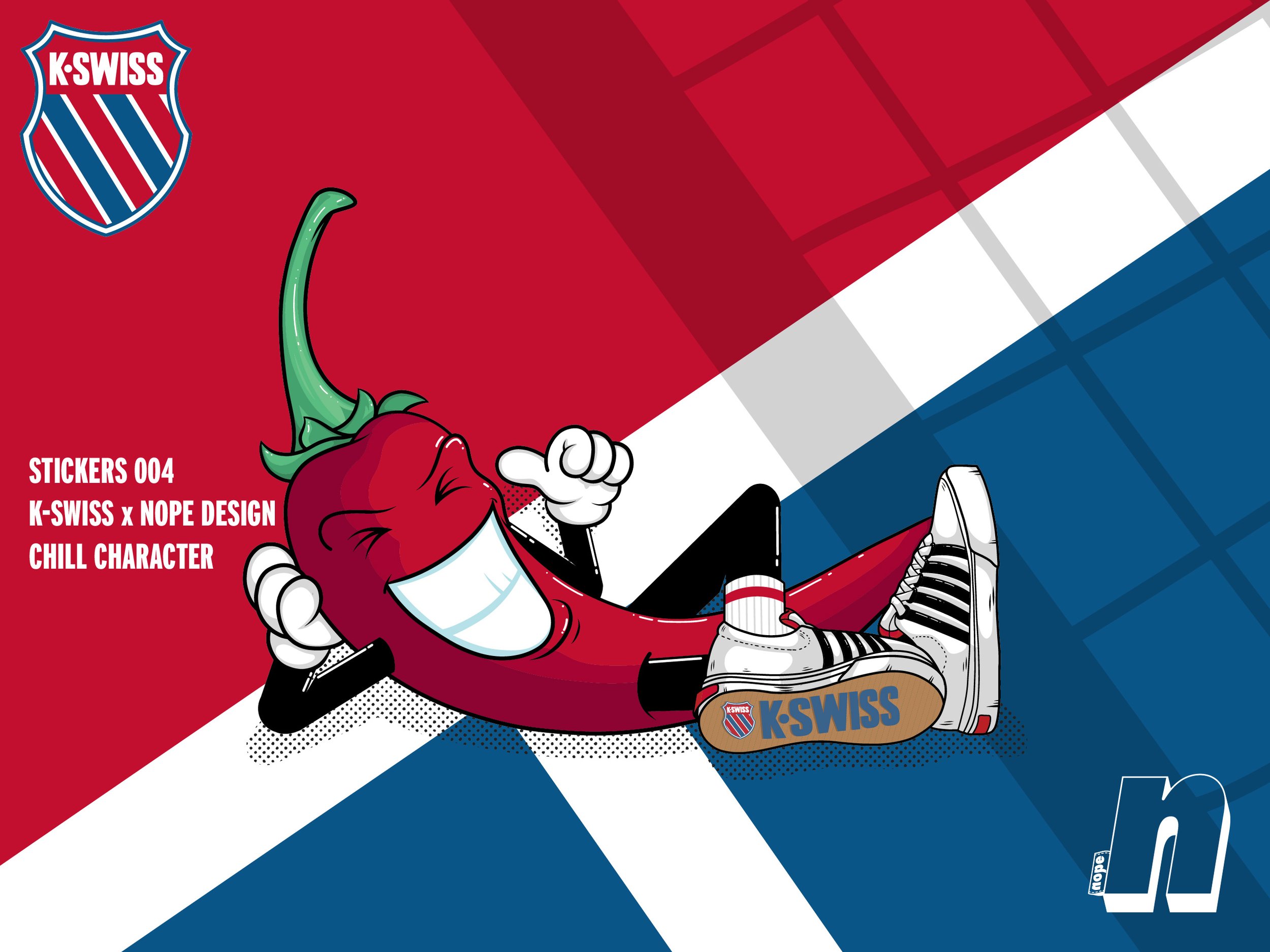
For this exciting collaboration with K-Swiss, I designed a series of bold, dynamic stickers that encapsulate the brand's heritage and fresh, modern vibe. Produced with the help of my trusted sticker partner StickerApp, these designs were crafted as part of a seasonal launch for K-Swiss's latest collections. The stickers served multiple purposes: they were distributed to B2B clients, gifted to key social influencers, and even included in select sneaker boxes for a unique unboxing experience. This project highlights the versatility of creative branding and how stickers can extend a brand’s story, leaving a lasting impression with every detail. Take a look at the designs and see how K-Swiss and Nope Design came together to celebrate bold visuals and sneaker culture.


K-SWISS BROCHURE
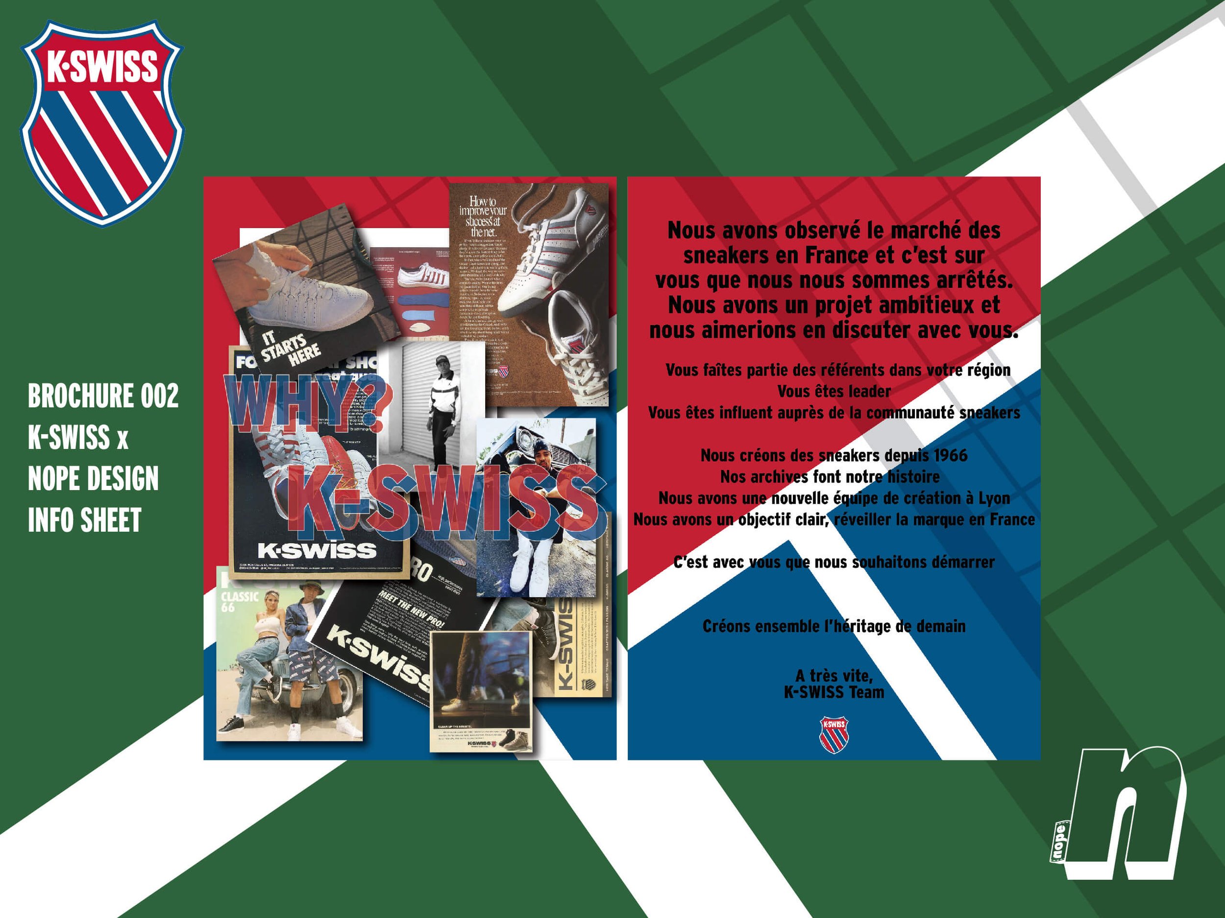
As part of the larger K-Swiss sticker and branding project, I created a compact and visually striking informational brochure. These brochures were designed to align with the seasonal collection launch, emphasizing K-Swiss's heritage and modern direction. Featuring bold layouts, iconic red, white, and blue brand colors, and a mix of French and English content, the brochures highlight the brand's global presence since 1966. Distributed alongside stickers to B2B clients and influencers, these brochures reinforced the storytelling behind the campaign and brought focus to K-Swiss's evolving strategies in key markets


Helene Claeys
"Working with Nope Design was a pleasure. The designs brilliantly captured K-Swiss’s heritage with a fresh, modern edge. From stickers to brochures, every piece resonated with our audience perfectly."


